The blog of David Michael Wright - Freelance Illustrator

Hello, and welcome to my humble blog!

If you too like the drag of Graphite on Paper, can appreciate the flick of a well executed Brushstroke, and like I favour subjects of the Dark and the Monstrous, the Weird and the Wonderful, the Abominable, Diabolical, Fantastic, Dramatic, Adventurous, Ghastly, Nightmarish and Phantasmagorical!

…Or like myself, seek to devour all sources of the Technical, Practical, Methodical and Inspirational!

Then perhaps this blog is for you.

It is (I hope) to become a progressive ongoing account of my endeavours as a Freelance Illustrator specialising in mainly the Fantasy, Sci-Fi, and Horror art genres. As is always the case (except perhaps on Sundays) I will do my very best and veritably strain heart and nerve and sinew to write a faithful accounting of all my latest Discoveries, Resources, Technical Explorations and Inspirations, in addition of course to featuring regular posts of my current Creative Exploits and Works in Progress.

Enjoy!


Friday 3 December 2010

Hello... hello... hello - Is there anybody in there? Just nod if you can hear me, Is there anyone at home?

Apologies for the lack of blog updates throughout November. I've been busy completely rebuilding and redecorating my little studio intensively for the better part of last month (Long overdue!) - It's all pretty much finished now but for a few minor bits and pieces I need to sort out, really pleased with how things are going - So regular blog services shall resume shortly!

Meanwhile - Here are a recent small sketch and value study done in preparation for an Acrylic painting demonstration I gave at the Barnburgh Art Group last month....

Saturday 16 October 2010

Cathay: The Five Kingdoms Art Preview

Just had a few of my black and white interior pieces which I created for the forthcoming Earthdawn - Cathay: The five Kingdoms sourcebook previewed on the Redbrick website. They can be found at - Link

Friday 24 September 2010

Colour Psychology

I've been thinking a lot about my colour selections lately, in particular about what colours could be chosen to complement and enhance elements in a painting where a certain pictorial narrative or overall 'mood' is the aim.

To this end I've been trying to formulate a loose personal guide/system to base my own colour judgements around. As a means to finding a possible solution I decided to research Colour Psychology on the net. Certain colours are said to have certain common associations (Blue = melancholy, Green = Nature, envy etc etc). Although these associations are entirely subjective and often substantially vary according to nationality, there do seem to be some pretty consistently reccuring notions, which I think should definitely be capitalised on by the artist (as they offer a common reasonably accepted basis for making contextual colour = mood/emotion/theme judgements).

Here are a few Colour Psychology tables I found scattered about the internet which demonstrate various colour associations...

Link - http://webdesign.about.com/od/colorcharts/l/bl_colorculture.htm


Tuesday 24 August 2010

New Painting!

Medium - Acrylic, Size - 11 x 16 inches.

Monday 26 July 2010

Dragon Project

Having recently read the fantastic new book Imaginative Realism by James Gurney. I've been inspired to try and use models and modelling a lot more than I do as a means to solve illustrative problems. I was very into modelmaking when I was younger and would regularly play tabletop wargames where just about all the terrain used to support the painted miniatures was hand made, so felt I already had some basic starter knowledge in this respect which could be built upon and utilised. This probably sounds slightly odd but I almost feel like reading Mr Gurney's book has 'legitimised' that kind of approach to illustrative problem solving for me, as seeing someone proffesionally work in this way is an affirmation of the approach itself. So I'm currently all fired up at the moment modelling this and that and randomly painting all manner of bits and pieces from around the house grey (to check out the lighting, textural qualities, and natural form in absence of the distraction of their local colours) and I've also started to create a new '3D box' full of small interesting textured objects, modeled aids, simple forms and such, which is to be an additional 3D facet of my reference library.

Anyhow. Dragon Project! I decided to make a rough model of a dragon last week, and then use it as a tool to create a painting from. Here are a few photos I took along the way...


Might make some miniature weapons soon, so I can use them as visual aids when working on extreme forshortened views, I think a mace would be handy, and a poseable ball and chain could be pretty cool too.


Links


James Gurneys blog - http://gurneyjourney.blogspot.com/

Saturday 10 July 2010

My reference finding procedure


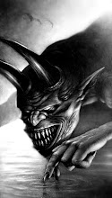
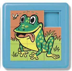
Over the last 15 years or so I've sort of incrementally horded all manner of random stuff that I had thought at this or that time might be useful as reference for a painting. This is all well and good, and although over the more recent of those years I have healthily discovered and fully embraced the incredible and extraordinarily wonderful merits of self organisation (Prior to this point I regret, I was a fine art degree post graduate messy person unwittingly living in my very own Jackson Pollockesque 3D oblivion and rummaging around a room not entirely unreminisent of one of those flat picture sliding square slot puzzles you can get at the seaside, and as a consequence spending ages and ages looking for bits of equipment my room ate :) I'm still not 'quite' there yet. Sure, my little studio is now relatively tidy, and sure I now try and keep just the equipment I need right at hand. But there is this one particular recurring thing which currently bugs me at the moment. It's this - I do a piece of painting, and although I always incorporate referencing into my practice, I often find that after I've finished a painting I seem to then promptly experience a sort of almighty reference epiphany (oooooo! ping!), and shortly after lay my hands on what would have been the perfect piece of reference for the piece now completed. Arrrgh! Anyhow, rambling on as usual, this here below is a personal attempt to rectify the problem, I'm not one for writing down hard and fast rules (as they can inhibit), but Notes, Principles and Procedures, I feel can be mighty useful and beneficial. Especially when you've a brain like mine that seems to slosh and spill its contents everywhere even as I make my best if somewhat futile efforts to fill it. So without further ado, may I please introduce to you, the revolutionary, all new, handy dandy, David Michael Wright 2010 Reference Procedure! (take it away bob...)

----------------------------------------------------------------------------------

My Reference finding Procedure (2010)

Ask and answer myself the following each project…

1. Are there any Objects available to me that are similar or exactly as I require, in form, appearance or texture that could aid me in solving the problems this assignment presents?

2. Are there any Photographic opportunities I might capitalise on to capture images of the elements I require within the assignment, that are similar or exactly as I require, in form, appearance or texture, and that could aid me in solving the problems the assigned work presents?

3. Are there any Constructive approaches I might take (Modelling perhaps, or combinations of found objects to be used representationally) which would aid myself in solving the problems the assigned work presents?

4. Have I searched my Reference Libraries (book, film, and computer based) for solutions that could aid or enhance my approach to this project? (Internet?)

5. Have I collected Material or Photographic samples/examples of all the Textures that I will be required to represent within this assignment?

6. Do I need to research any Specialist Knowledge (Technology, History, Fashions etc) to complete this assignment?

7. Do I have access to any media that echoes a similar Mood to that which I wish to create? (e.g. – Dark lavish sword and sorcery fantasy might equal John Boorman’s Excalibur or such like) .

----------------------------------------------------------------------------------

It's not the ultimate solution, I know, but at least I'll I can now be certain I've given all the various reference possibilities some thought before I begin painting.

Any comments or further suggestions most welcome.

Dave :)

Thursday 3 June 2010

Make your own colour reference diary!


Some years ago, whilst studying for my fine art degree, I was discussing colour theory with my life drawing and painting tutor, and he mentioned to me that one of the most useful things he had ever done with regard colour (In a traditional painting sense) was to keep and update a detailed personal colour diary.
He described his approach to this and how he would paint down and record all of the colours in his collection so as to have a actual visual reference at hand of how any paint would look when it was dry, and how by doing this he was then able to more accurately make colour decisions and judge how any given paint colour would behave when applied, as opposed to just referring to the printed representation of the colour on the paint tube label. A record was also to be made of the various pigment properties and qualities of the paint (Transparent, Opaque, Permanence etc), and the dried appearance of the paint could also be noted (Matt, Glossy etc), plus diluted, and tinted effects explored. He also suggested this colour recording method be expanded to include any subsequent experimental successes with colour (mixes, combinations etc) and so used to make notes of any personal colour preferences as a route to ultimately discovering a personal working palette through developing first hand experience and knowledge of paint colour behaviour through recorded experimental exploration, as opposed to simply seeking to adopt the old masters palettes or such strategies.

Recognising the merit of this idea at the time, I took him up on his suggestion and put together my own slightly ramshackle version of a colour diary, which has been progressively refined, reshuffled, and added to over time. I think it’s a great working asset and a really useful learning method too, and thought it would be a good thing to share online.

Friday 5 March 2010

Plague of the Demons


I'm trying to push myself to do more larger pictures, get out of my comfort zone and try and step things up a bit from interior illustration. This is a sort of practice piece I did to that end for some friends of mine who are just putting an album together and wanted something with a fantasy horror edge for their CD Cover.

Wednesday 6 January 2010

Make your own Golden Mean Gauge!


The golden mean is a unique and wonderful thing. I first learned about it quite by chance myself, when an old lady friend of my Granddad’s kindly gave me her entire collection of art magazines that she had saved up in her attic and use to subscribe to when she was younger. Within the pages of one of the two hundred or so magazines I found a complete article on the golden mean.

The golden mean is in practical terms a mathematical ratio, which represents in numbers a proportional division that occurs more often than any other natural pattern within nature. It can be observed almost everywhere (if you are looking for it) and can and has been utilised by artists going right back to the ancient Greeks.

It’s best practical use to artists in my opinion is in solving to some extent some of the problems of composition and design in art. Wherever you have to make a decision about a random proportion and don’t know where to mark a division - the golden mean is an invaluable tool! Some things just don’t seem right when dealing with element ratios (space and form positioning and division of masses) in artwork, all the features can be accurate and well rendered but they sometimes just seem ‘uncomfortable’ to look at. I think over time people can develop a loose sense of what works with repeated practice, but the path to that point is full of hit and miss experimentation (and a lot of the aaargh factor), with this elusive and highly subjective ‘Rightness’ aspect never making any real logical sense at all.

This is where the golden ratio comes in handy! It won’t answer that big ‘rightness’ question (if any ones sussed it out please tell me :) - but it can help to solve some of the associated problems. The figure (Phi) 1.618033988749895 (call it 1.62 rounded up) is the magic number, and when divided into any measurement it produces a proportional separation which is commonly regarded as pleasing to the eye (most probably due to its dominance as the most familiar and recurring natural pattern division). So you get the idea, for example - problem – How log shall I make the dagger blade in relation to the handle, pommel, and hilt? Answer = draw a length divide it by 1.62 and bob’s your uncle! Problem – Where would be a nice place to put the horizon in my picture? Answer = Measure the height of the drawing space and divide it by 1.62 and mark the division. Here are 2 possible solutions to somewhat random problems backed up by the natural world, which you now have the option of taking or leaving (Which sure beats shooting blind).

Now who the heck wants to work their artwork out with a calculator! Nope me neither! That’s why I had a look on the net to see if there was a gauge that supported this ratio, and there is. Dentists use them all the time when making false teeth, to get a nice balance between differing tooth sizes, but they are very expensive to buy and have only a small-scale capacity.
To cut a long story a tad shorter, I found a guide to make your own out of card and paper press-studs (see above) and it works great! I made some scale adaptations for a subsequent smaller pocket sized version that I use to do tiny divisions (see picture) for use on thumbnails, as the standard version has a limited minimum size use. It should be reasonably clear from the photos how to do the modifications if you wish to do the same too (see photos).

But it’s a great device! I use it most days, and it solves me loads and loads of problems, probably one of the best practical tools I’ve ever found, and the possibilities for its application in art and design are vast. Best of all it’s FREE with a bit of sweat. Thought it’d be nice thing to share it with anyone who’s interested – so enjoy! Let me know if you love it as much as me.