Monday, 7 March 2016


Wednesday, 31 December 2014
The Voodoolych of Kooglarr II
Just finished off a new personal/portfolio painting, entitled "The Voodoolych of Kooglarr II".
Here's the process for the piece from the line drawing leading up to the final image.
Enjoy!


%2B-%2BDMWright.jpg)
-Original Medium: Acrylic.
-Purpose/Client: Personal/Portfolio Artwork 2014.
-Original Art Size 15 x 15” inches
-Original artwork availability - For sale $666.00 at Link
-Licensing available at www.davidmichaelwright.com
-Prints Available Via Redbubble - Link
©David Michael Wright 2014
"The heights charm us, but the steps do not; with the mountain in our view we love to walk the plains"
- Johann Wolfgang von Goethe
Here's the process for the piece from the line drawing leading up to the final image.
Enjoy!
-Original Medium: Acrylic.
-Purpose/Client: Personal/Portfolio Artwork 2014.
-Original Art Size 15 x 15” inches
-Original artwork availability - For sale $666.00 at Link
-Licensing available at www.davidmichaelwright.com
-Prints Available Via Redbubble - Link
©David Michael Wright 2014
"The heights charm us, but the steps do not; with the mountain in our view we love to walk the plains"
- Johann Wolfgang von Goethe
Wednesday, 27 August 2014
Equinox - Setting Guide
This is a piece of cover artwork I did earlier on this year for the recently released Equinox Setting Guide!
I feel like I ironed out a few persistent niggling mental creases and inched myself forward a little bit technically with this one. It was a challenge, and a lot of fun to do.
"Equinox is a future fantasy setting of stunning action, frightening intrigue, and mystical powers set in a war-ravaged dark future!"
It is published by Vagrant Workshop (www.vagrantworkshop.com), and can be purchased from Drive Thru RPG
%2B-%2BD.M.Wright.jpg)

I feel like I ironed out a few persistent niggling mental creases and inched myself forward a little bit technically with this one. It was a challenge, and a lot of fun to do.
"Equinox is a future fantasy setting of stunning action, frightening intrigue, and mystical powers set in a war-ravaged dark future!"
It is published by Vagrant Workshop (www.vagrantworkshop.com), and can be purchased from Drive Thru RPG
"The mind is not a vessel to be filled, but a fire to be kindled."
- Plutarch (Greek historian, biographer & essayist 45 - 120 AD)
Tuesday, 29 April 2014
Psychomancer
New portfolio painting...
 Title - Psychomancer
Medium - Acrylic (Mixed - Touches of Pencil & Gouache)
Client/Purpose - Portfolio work
Original Artwork - $200 - Link
Licensing - Available (see website for details)
"The frost, the snows, the tempests, the lightnings, are the rough teachers that bring the tiny acorn to the sturdy oak... Obstacles, hardships are the chisel and mallet which shape the strong life into beauty"
- Orison Swett Marden (1850 - 1924)
Medium - Acrylic (Mixed - Touches of Pencil & Gouache)
Client/Purpose - Portfolio work
Original Artwork - $200 - Link
Licensing - Available (see website for details)
"The frost, the snows, the tempests, the lightnings, are the rough teachers that bring the tiny acorn to the sturdy oak... Obstacles, hardships are the chisel and mallet which shape the strong life into beauty"
- Orison Swett Marden (1850 - 1924)
Wednesday, 13 November 2013
Aethercon!
I'll be attending Aethercon on the 15th to the 17th November, an entirely online gaming convention with all sorts of exciting stuff going on from Friday to Sunday. Check it out at - Link

I'll be there doing a daily 3 hour booth slot within the Artists Enclave, chatting with folks, doing some sketching and participating in a couple of the Speed Painting events.
My booth times are...
Friday 15th - 4:00 to 7:00pm EST (9:00 to 12:00pm GMT)
Saturday 16th - 2:00 to 5:00pm EST (7:00 to 10:00pm GMT)
Sunday 17th - 2:00 to 5:00pm EST (7:00 to 10:00pm GMT)
The Speed painting duels will be taking place on Friday 15th at 4:10pm EST (9:10pm GMT) and on Sunday 17th at 2:10pm (7:10pm GMT). They will both run for 40 minutes, and the audience will pick the winner.
You can find my booth at - Link - See you there!

I'll be there doing a daily 3 hour booth slot within the Artists Enclave, chatting with folks, doing some sketching and participating in a couple of the Speed Painting events.
My booth times are...
Friday 15th - 4:00 to 7:00pm EST (9:00 to 12:00pm GMT)
Saturday 16th - 2:00 to 5:00pm EST (7:00 to 10:00pm GMT)
Sunday 17th - 2:00 to 5:00pm EST (7:00 to 10:00pm GMT)
The Speed painting duels will be taking place on Friday 15th at 4:10pm EST (9:10pm GMT) and on Sunday 17th at 2:10pm (7:10pm GMT). They will both run for 40 minutes, and the audience will pick the winner.
You can find my booth at - Link - See you there!
Tuesday, 5 November 2013
(TEMPORARY POST) - TESTING BLOGGER TO FACEBOOK LINK UP.
IFTTT TEST (TEMPORARY POST) - TESTING BLOGGER TO FACEBOOK LINK UP.


Friday, 18 October 2013
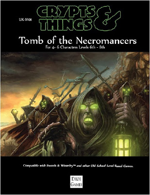
Tomb of the Necromancers
Just had an image of mine published on the cover of the new D101 Games, Crypts & Things supplement Tomb of the Necromancers!
If you like your old school Swords and Sorcery fantasy roleplaying adventures - check it out at Link :)
“Thoughts are the shadows of our feelings - always darker, emptier and simpler.”
Friedrich Nietzsche - German Philosopher (1844 - 1900).
If you like your old school Swords and Sorcery fantasy roleplaying adventures - check it out at Link :)

“Thoughts are the shadows of our feelings - always darker, emptier and simpler.”
Friedrich Nietzsche - German Philosopher (1844 - 1900).
Friday, 12 July 2013
More Victoriana 3E
Here's another interior image I painted for the newly released Victoriana 3rd Edition.

©2013 Cubicle 7 Entertainment Ltd
Title - Pickpocket, Physician, Pilot
Media - Acrylic
Client - Cubicle 7
"the best way out is always through"
- Robert Frost

©2013 Cubicle 7 Entertainment Ltd
Title - Pickpocket, Physician, Pilot
Media - Acrylic
Client - Cubicle 7
"the best way out is always through"
- Robert Frost
Wednesday, 17 April 2013
Victoriana Third Edition
Just had one of my illustrations featured in a post about the forthcoming Victoriana 3rd Edition Encyclopaedia over on the Cubicle 7 website! Check out the article at - Link
and here's the image...
+-+D.M.Wright.jpg)
©2013 Cubicle 7 Entertainment Ltd
Title - The Alumnat
Medium - Acrylic
Client - Cubicle 7
Original artwork size - 7.5 x 9.3/4 inches
“All things are subject to interpretation whichever interpretation prevails at a given time is a function of power and not truth.”
Friedrich Nietzsche - German Philosopher (1844 - 1900)
and here's the image...
+-+D.M.Wright.jpg)
©2013 Cubicle 7 Entertainment Ltd
Title - The Alumnat
Medium - Acrylic
Client - Cubicle 7
Original artwork size - 7.5 x 9.3/4 inches
“All things are subject to interpretation whichever interpretation prevails at a given time is a function of power and not truth.”
Friedrich Nietzsche - German Philosopher (1844 - 1900)
Sunday, 20 January 2013
The Perforation of Nylokh
.jpg)
Title - The Perforation of Nylokh
Client/Perpose - Personal/Portfolio work
Media - Acrylics
Original Size - 11.5 x 8.5"
"You can't stay in your corner of the forest waiting for others to come to you. You have to go to them sometimes."
- Winnie the Pooh
Tuesday, 1 January 2013
New Years Dragon!
jpg.jpg)
Client/Perpose - Promotional/Portfolio work
Media - Acrylics
Original Size - 12 x 12"
"We're our own dragons as well as our own heroes, and we have to rescue ourselves from ourselves."
- Tom Robbins (American Novelist 1936 -)
Monday, 5 November 2012
Living Weapons
Just finished this today...
.jpg)
Title - Living Weapons
Purpose/Client - Personal/Portfolio Work
Media - Acrylic Ink on Hot Press Illustration Board
"Deep into that darkness peering, long I stood there, wondering, fearing, doubting, dreaming dreams no mortal ever dared to dream before."
- Edgar Allan Poe
.jpg)
Title - Living Weapons
Purpose/Client - Personal/Portfolio Work
Media - Acrylic Ink on Hot Press Illustration Board
"Deep into that darkness peering, long I stood there, wondering, fearing, doubting, dreaming dreams no mortal ever dared to dream before."
- Edgar Allan Poe
Friday, 26 October 2012
The Carnivorous Trees of Kullumahn Pass
New Painting...
-.jpg)
Title - The Carnivorous Trees of Kullumahn Pass
Purpose/Client - Personal/Portfolio Work
Media - Acrylic Ink on Hot Press Illustration Board
Original Size - 31 x 20.5cm
-.jpg)
Title - The Carnivorous Trees of Kullumahn Pass
Purpose/Client - Personal/Portfolio Work
Media - Acrylic Ink on Hot Press Illustration Board
Original Size - 31 x 20.5cm
“Beware that you do not lose the
substance by grasping at the shadow.”
- Aesop Wednesday, 15 August 2012
The Experiment...
I mentioned in my last post that I was going to try out a slightly new way of working as a bit of an experiment, essentially the crux of the idea was to try to paint directly over a fully toned pencil drawing eliminating the need to do a tonal underpainting (to save time). Things didn't work out 'quite' as had thought they might, though I feel I have definitely learned some things in the process of testing this out. What follows is a quick run through of the process and my thinking on each stage of this piece...
First up is the drawing on the illustration board ready to go...

The first thing I did next was spot in all the extreme blacks...

I realised at this point that what would become the (value - dark grey 6/7ish) shadow tones were by going to be way too light to hold up in just overpainted pencil, and I felt that the image would fail if I didn't rectify this problem straight away - so I mixed up a warm reddish brown of the correct value and put this over what were to become the darker (but not black) shadow areas. Which was really easy to do as I had already drawn in where these should be in the pencil. The experiment as I intended failed at this point as I had essentially created a tonal underpainting despite not wanting to. I still really wanted to make the image work though and continued on with painting process...

The next step was to overlay some transparent colour - I used acrylic inks and worked outwards from my focal point taking a warm yellow to yellow green to green to a greeny blue working around the colour wheel and keeping things bold and powerful but harmonious...

Next step was the backgrond, as I had stuck to all warm colours for the foreground (a warm yellow, a warm blue) I chose a cool blue for the background (cool colours recede) and I felt this would make a good contrast...

Edges next! I always call this faze 'edgebusting!' Acrylic paint always leaves hard edges everywhere, It is useful at times and a bain at others, if you want a soft edge in acrylic you have to actively make it soft, I do this by mixing an appropriate transitional tone which will take one colour/area over to another more subtly, you basically then have 3 lines in acrylic, it's a bit of a cheat but the effect is that it looks softer. Hard lines attract attention so only leave them where you want attention attracting!

Next step I faded out the background with a darker blue tone using an airbrush, I don't especially like an airbrushed look to my work though I find as a tool it is very useful (especially when working with acrylic) for dealing with anything 'atmospheric' (layers receeding into depth, nimbus & special lighting effects etc). So if I choose to use the airbrush in a painting I always try to use it as a means to achieve a definite effect 'within' and as a part of the bigger painting process (on top of brushwork/underneath brushwork etc), it plays it's part as a useful tool and is good at it in that respect, I think too much airbrushing can kill a painting, unless it is intended to be an airbrushed painting.

Next I began highlighting areas, opaque acrylic (mostly white, yellow, and other opaque colours as needed) were mixed with the ink to opacify it and this was then used to work onto the transparent underpainting...

More and more highlights are added, this is where you have to make a clear judgement as to how the light would strike the form, and what reflective qualities the object being struck has, whatever judgements you make here have to remain consistent throughout the process.

More highlights...

I got the airbrush out here again and added a slight flaring of the light over the shoulders of the character to try and link the foreground in with the backgound a little.

At this point I was ready to call it finished, but it occured to me that the balance of black, white, and midtoned areas was a bit off - the image needed more shadow definition.

I cut back into the darker areas with a pure black trying to define more clearly the shadow side and then re-softened the edges.

This is what happens when I scan an image - It goes all dull and dark! This almost always happens! (I guess it does to everyone? - If not somebody PLEASE tell me what I'm doing wrong!). So anyhow I run this shadowy form through photoshop and tweak all the levels with the original at hand so I can match it up as best I can, and then add any improvements if necessary. The photographs show the true colours of the original quite accurately above (so you can see what I was aiming at), anyhow then thats it... Done!

Conclusions wise - I guess I really DO have to set out the tones (in paint) soundly in preparation/underpainting, as the pencil even at its darkest value isn't black, and all the other tones are similarly lighter than they seem. Ah well it was definitely worth a go - not to worry, all good fun!
Positives - What I did find was that by having a clear path as to where to put those painted tones it sped up the underpainting/tonal stage up dramatically as I could blast them straight in! I think what I'll try next is drawing in a way that clearly notes where the mid and darks are going to go (figure them all out at pencil stage), and how the light is to hit the form, not an overlaiden 'fully toned' pencil drawing as in this experiment, but definitely somthing with more definitive shadow notations than my regular line drawing method.
More soon! :)
"I have always been delighted at the prospect of a new day, a fresh try, one more start, with perhaps a bit of magic waiting somewhere behind the morning."
- J. B. Priestly
First up is the drawing on the illustration board ready to go...

The first thing I did next was spot in all the extreme blacks...

I realised at this point that what would become the (value - dark grey 6/7ish) shadow tones were by going to be way too light to hold up in just overpainted pencil, and I felt that the image would fail if I didn't rectify this problem straight away - so I mixed up a warm reddish brown of the correct value and put this over what were to become the darker (but not black) shadow areas. Which was really easy to do as I had already drawn in where these should be in the pencil. The experiment as I intended failed at this point as I had essentially created a tonal underpainting despite not wanting to. I still really wanted to make the image work though and continued on with painting process...

The next step was to overlay some transparent colour - I used acrylic inks and worked outwards from my focal point taking a warm yellow to yellow green to green to a greeny blue working around the colour wheel and keeping things bold and powerful but harmonious...

Next step was the backgrond, as I had stuck to all warm colours for the foreground (a warm yellow, a warm blue) I chose a cool blue for the background (cool colours recede) and I felt this would make a good contrast...

Edges next! I always call this faze 'edgebusting!' Acrylic paint always leaves hard edges everywhere, It is useful at times and a bain at others, if you want a soft edge in acrylic you have to actively make it soft, I do this by mixing an appropriate transitional tone which will take one colour/area over to another more subtly, you basically then have 3 lines in acrylic, it's a bit of a cheat but the effect is that it looks softer. Hard lines attract attention so only leave them where you want attention attracting!

Next step I faded out the background with a darker blue tone using an airbrush, I don't especially like an airbrushed look to my work though I find as a tool it is very useful (especially when working with acrylic) for dealing with anything 'atmospheric' (layers receeding into depth, nimbus & special lighting effects etc). So if I choose to use the airbrush in a painting I always try to use it as a means to achieve a definite effect 'within' and as a part of the bigger painting process (on top of brushwork/underneath brushwork etc), it plays it's part as a useful tool and is good at it in that respect, I think too much airbrushing can kill a painting, unless it is intended to be an airbrushed painting.

Next I began highlighting areas, opaque acrylic (mostly white, yellow, and other opaque colours as needed) were mixed with the ink to opacify it and this was then used to work onto the transparent underpainting...

More and more highlights are added, this is where you have to make a clear judgement as to how the light would strike the form, and what reflective qualities the object being struck has, whatever judgements you make here have to remain consistent throughout the process.

More highlights...

I got the airbrush out here again and added a slight flaring of the light over the shoulders of the character to try and link the foreground in with the backgound a little.

At this point I was ready to call it finished, but it occured to me that the balance of black, white, and midtoned areas was a bit off - the image needed more shadow definition.

I cut back into the darker areas with a pure black trying to define more clearly the shadow side and then re-softened the edges.

This is what happens when I scan an image - It goes all dull and dark! This almost always happens! (I guess it does to everyone? - If not somebody PLEASE tell me what I'm doing wrong!). So anyhow I run this shadowy form through photoshop and tweak all the levels with the original at hand so I can match it up as best I can, and then add any improvements if necessary. The photographs show the true colours of the original quite accurately above (so you can see what I was aiming at), anyhow then thats it... Done!

Conclusions wise - I guess I really DO have to set out the tones (in paint) soundly in preparation/underpainting, as the pencil even at its darkest value isn't black, and all the other tones are similarly lighter than they seem. Ah well it was definitely worth a go - not to worry, all good fun!
Positives - What I did find was that by having a clear path as to where to put those painted tones it sped up the underpainting/tonal stage up dramatically as I could blast them straight in! I think what I'll try next is drawing in a way that clearly notes where the mid and darks are going to go (figure them all out at pencil stage), and how the light is to hit the form, not an overlaiden 'fully toned' pencil drawing as in this experiment, but definitely somthing with more definitive shadow notations than my regular line drawing method.
More soon! :)
"I have always been delighted at the prospect of a new day, a fresh try, one more start, with perhaps a bit of magic waiting somewhere behind the morning."
- J. B. Priestly
Friday, 10 August 2012
Developed...
One of the thumbnails from yesterday, enlarged, transfered to illustration board, and fully developed in pencil tonally.

As I mentioned in a previous post, I'm currently trying to figure out a way that works (and feels comfortable for me) whereby I can incorporate more of my drawing process directly into the finished painting. This here is going to be a bit of an experiment to that end. In this piece im going to try painting directly over a full value tonal drawing in transparent paint, I can't think why this shouldn't work, as I currently normally do a full tonal underpainting in paint under the colour anyhow - so this 'should' if it works blend 2 of my working stages into 1 (hopefully!) and make things a lot less tedious and a lot more fun by allowing me to do a little more in the drawing stage and not have to repeat it all over again! I guess I'll find out soon one way or the other anyhow, just about to crack out the paints now - So I'll let you all know how it goes :).
"Once more unto the breach, dear friends, once more;
Or close the wall up with our English dead.
In peace there's nothing so becomes a man
As modest stillness and humility;
But when the blast of war blows in our ears,
Then imitate the action of the tiger. . . ."
- William Shakespeare - Henry The Fifth Act 3, scene 1, 1–6

As I mentioned in a previous post, I'm currently trying to figure out a way that works (and feels comfortable for me) whereby I can incorporate more of my drawing process directly into the finished painting. This here is going to be a bit of an experiment to that end. In this piece im going to try painting directly over a full value tonal drawing in transparent paint, I can't think why this shouldn't work, as I currently normally do a full tonal underpainting in paint under the colour anyhow - so this 'should' if it works blend 2 of my working stages into 1 (hopefully!) and make things a lot less tedious and a lot more fun by allowing me to do a little more in the drawing stage and not have to repeat it all over again! I guess I'll find out soon one way or the other anyhow, just about to crack out the paints now - So I'll let you all know how it goes :).
"Once more unto the breach, dear friends, once more;
Or close the wall up with our English dead.
In peace there's nothing so becomes a man
As modest stillness and humility;
But when the blast of war blows in our ears,
Then imitate the action of the tiger. . . ."
- William Shakespeare - Henry The Fifth Act 3, scene 1, 1–6
Tuesday, 3 April 2012
The Deathly Entourage of King Valdos of Tekhannis
Latest painting...

Title - The Deathly Entourage of King Valdos of Tekhannis
Client - Portfolio Work
Medium - Acrylic on Illustration Board
"Diamonds are nothing more than chunks of coal that stuck to their jobs."
- Malcolm Forbes

Title - The Deathly Entourage of King Valdos of Tekhannis
Client - Portfolio Work
Medium - Acrylic on Illustration Board
"Diamonds are nothing more than chunks of coal that stuck to their jobs."
- Malcolm Forbes
Monday, 13 February 2012
Organising my Paints - and Stuff!
Continuing along with my 2012 'organising everything' resolution/'big efficiency drive' :) I decided to give my paint collection a bit of a going over last weekend...
I thought it would be a smart idea to pick out the paints I use the most - separate them from all the others and put them in a tray at hand. In addition to this I then painted all the tops of my paint white and then again with each of their individual respective colours. I then gave all the tops a quick coat of clear varnish to stop me rubbing the paint off over time as I keep popping the lids to use them. My reasoning behind this was that I would now be able to easily see at a glance what the actual colour will look like used raw when it is dry (on a White ground), making (I hope) selecting the right colour a modicum easier.
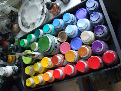
I tend to mostly use Liquitex soft body or W&N Acrylic Paints in combination with Daler FW Acrylic Inks these days. I find using the ink to enhance and support the thicker acrylics makes for more versatility as it is possible to increase the fluidity of a thicker colour without desaturating it (which can be handy at times), and I also find very tight detailing easier to manage with slightly thicker acrylic when there is a little ink mixed with the paint too (it makes the paint cover and flow REALLY well when applying tiny strokes!).
In addition to organising my Liquitex paint set in the manner described above, I also made myself a full 'At a glance' Colour Sheet of all my FW Inks too.
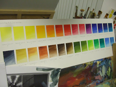
Hopefully making these small changes in this area will help me to choose, and use, the paint I have at hand a little more effectively.
"Anyone who stops learning is old, whether at twenty or eighty. Anyone who keeps learning stays young. The greatest thing in life is to keep your mind young."
- Henry Ford (American Industrialist, 1863 – 1947)
I thought it would be a smart idea to pick out the paints I use the most - separate them from all the others and put them in a tray at hand. In addition to this I then painted all the tops of my paint white and then again with each of their individual respective colours. I then gave all the tops a quick coat of clear varnish to stop me rubbing the paint off over time as I keep popping the lids to use them. My reasoning behind this was that I would now be able to easily see at a glance what the actual colour will look like used raw when it is dry (on a White ground), making (I hope) selecting the right colour a modicum easier.

I tend to mostly use Liquitex soft body or W&N Acrylic Paints in combination with Daler FW Acrylic Inks these days. I find using the ink to enhance and support the thicker acrylics makes for more versatility as it is possible to increase the fluidity of a thicker colour without desaturating it (which can be handy at times), and I also find very tight detailing easier to manage with slightly thicker acrylic when there is a little ink mixed with the paint too (it makes the paint cover and flow REALLY well when applying tiny strokes!).
In addition to organising my Liquitex paint set in the manner described above, I also made myself a full 'At a glance' Colour Sheet of all my FW Inks too.

Hopefully making these small changes in this area will help me to choose, and use, the paint I have at hand a little more effectively.
"Anyone who stops learning is old, whether at twenty or eighty. Anyone who keeps learning stays young. The greatest thing in life is to keep your mind young."
- Henry Ford (American Industrialist, 1863 – 1947)
Friday, 10 February 2012
New Painting - At the Alter of Fhatt-Malokh Demonhe of Shin Shin Garr!
My latest effort...

Title - At the Alter of Fhatt-Malokh Demonhe of Shin Shin Garr
Client - Portfolio Work
Medium - Acrylic on Illustration Board
P.S - Website just updated! - www.davidmichaelwright.com
"The fact is, that to do anything in the world worth doing, we must not stand back shivering and thinking of the cold and danger, but jump in and scramble through as well as we can."
- Robert Cushing

Title - At the Alter of Fhatt-Malokh Demonhe of Shin Shin Garr
Client - Portfolio Work
Medium - Acrylic on Illustration Board
P.S - Website just updated! - www.davidmichaelwright.com
"The fact is, that to do anything in the world worth doing, we must not stand back shivering and thinking of the cold and danger, but jump in and scramble through as well as we can."
- Robert Cushing
Saturday, 21 January 2012
The 2012 ‘Will to Organise’ Spark hits the Kindling, Custom Electric Guitars, and some nifty Airbrush Artwork!
This year I’ve decided that my main overriding resolution is going to be - To try and get MORE Organised!
By...
- Cutting my working practices down to JUST what I actually really need to do to get the kind of high quality results I’m aiming for.
- Having only the equipment that I ACTUALLY REALLY USE around me, No unnecessary Clutter, I’m putting all the tools I rarely use into some accessible storage, and clearing out any definite junk.
- Archiving all my old artwork (This has been a long time coming!) Both on my computer and off. So I can find and refer to stuff I need much easier.
- Organising all my reference files, books, and resources better.
And, well, generally just trying to spot any waste and inefficiency really, so I can sort it out and try and make things work a little better.
Genius eh :) (cue fireworks!)
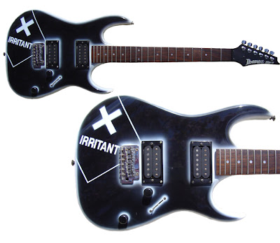
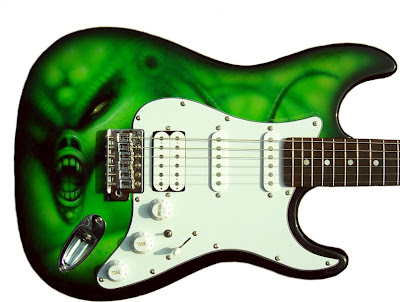
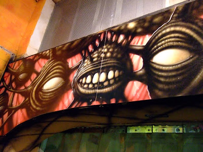
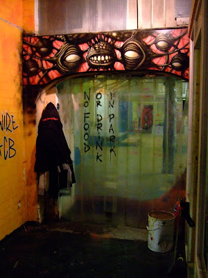
Anyhow, all that tedious tidying up business aside, while rooting through my archives the other day I found a few photos of some Airbrush Art I did some years ago and thought they would be something a bit different to post up here. Included are a couple of Custom Guitars I did for a local music store, and a larger interior piece created for some of my friends at a Skatepark in Dewsbury…
P.S website updates coming soon!
"Be regular and orderly in your life that you may be violent and original in your work."
- Clive Barker
By...
- Cutting my working practices down to JUST what I actually really need to do to get the kind of high quality results I’m aiming for.
- Having only the equipment that I ACTUALLY REALLY USE around me, No unnecessary Clutter, I’m putting all the tools I rarely use into some accessible storage, and clearing out any definite junk.
- Archiving all my old artwork (This has been a long time coming!) Both on my computer and off. So I can find and refer to stuff I need much easier.
- Organising all my reference files, books, and resources better.
And, well, generally just trying to spot any waste and inefficiency really, so I can sort it out and try and make things work a little better.
Genius eh :) (cue fireworks!)
Anyhow, all that tedious tidying up business aside, while rooting through my archives the other day I found a few photos of some Airbrush Art I did some years ago and thought they would be something a bit different to post up here. Included are a couple of Custom Guitars I did for a local music store, and a larger interior piece created for some of my friends at a Skatepark in Dewsbury…


P.S website updates coming soon!
"Be regular and orderly in your life that you may be violent and original in your work."
- Clive Barker
Subscribe to:
Posts (Atom)